The importance of dynamic design and layout
With over 50% of Australians now owning Smartphones, and over 7.5 million Australians accessing the internet via their mobile phones in any given month, the case for optimising online survey projects for mobile devices has become too strong to ignore.
Whether it’s an employee opinion or post transaction customer satisfaction survey, mobile is a great way to collect insight from a busy and ‘on the move’ target audience. In fact, a recent study from Forrester Research found that customers are more likely to interact with brands through mobile channels than via a PC. Forrester revealed that in the social networking sphere, for instance, 49 per cent of tablet users ‘like’ something a company posts at least on a weekly basis, compared to just 37 per cent of PC users.
The task of designing, producing and delivering effective feedback surveys that are optimised for mobile is fraught with danger. But as mobile is becoming an ever more viable means of surveying it is worth taking the time to learn the ropes. There are a number of important considerations to take into account to make sure your efforts are a success, and in this edition of MobileMatters we’re going to explore an important component – making sure your mobile survey features a dynamic design.
What is dynamic design?
In the context of mobile survey and web page design, a dynamic layout – often also referred to as responsive, adaptive or fluid – is one that adjusts automatically to neatly fit to the specific device on which the content is being viewed.
Most web pages are primarily designed to be viewed on desktop computers, and the fact of the matter is that these displays often look poor when viewed on devices such as tablets and smartphones. For example, when you open a web page or survey that has not been optimised for smaller screens the layout can be distorted on your device or the page can take a long time to load.
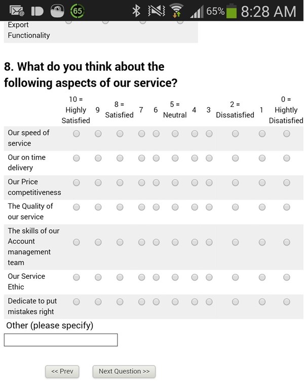
Let’s take a look a one example of how a common matrix question appears in a mobile for a survey not designed in mobile-friendly way. Notice how the answer scale layout is squashed, the text for each question is wrapping, and the spacing between radio buttons is inconsistent, making it incredibly hard for an average respondent to select their desired option with their fingers:

However, in using a dynamic design, your survey adapts intuitively depending on the type of device a respondent is viewing it on, and the size of its screen, which it instantly detects.
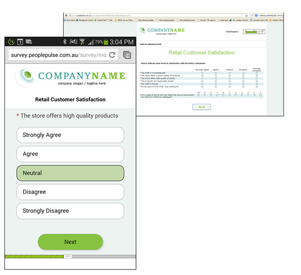
To demonstrate this let’s look at an example of a survey that has been optimised for mobile devices. The survey software automatically detects the device and shows the first question from the matrix as an easy to read single question on one page, with easily clickable answer options and large navigation buttons:
The exact same survey, shown on a desktop and a mobile screen:

This is important to consider given that response rates for mobile surveys can differ wildly depending on the size of the screen on which it is being viewed, and whether the survey has been tailored for mobile. The Online Survey Statistics from the Mobile Future study from Kinesis Survey Technologies in 2012, for example, found that mobile survey completion rates are typically the highest on iPad devices (35.28 per cent, compared to 11.23 per cent on iPhones, for instance).
According to Kinesis, this is largely due to the ability of iPad screens to support a range of survey formats and content – thus reinforcing the importance of investing effort to ensure your survey can adapt to different screen sizes.
Why dynamic design?
Using a dynamic design for your mobile survey makes complete logical sense, from both a practical and cost-effectiveness point of view.
A dynamic survey design offers savings in time and cost as there is no need to produce a different survey for each type of device and screen size. You simply create one survey in a mobile-ready tool, and allow it to automatically adjust its resolution when opened on any mobile device. The different types of content deployed in your mobile survey – from the text to images and graphics – are all optimised to fit the diverse range of screen sizes available today and streamline the user experience.
From an end-user point of view, these surveys are simply easier to navigate. For example, they won’t have to physically turn their device to landscape view, or zoom in or out to make the survey readable on the screen. The ‘Participation of mobile users in online surveys’ whitepaper from Decipher, Inc. acknowledges that while smaller device screens inevitably lead to lower completion rates than on desktop, this discrepancy can be substantially reduced if “smartphone friendly designs are employed”. (Stay tuned for us to explore the topic of mobile questionnaire length best practice in a future edition of MobileMatters).
In short, with a little planning and the right tools, you can create a survey that looks great on any device, is easy to answer, represents your brand in the best possible light, and generates great response rates.
Happy Surveying!
Ready to run to your next research project?
We’d love to speak with you to see if we can assist with your next mobile research project – please give us a call on +61 2 9232 0172 and ask for an obligation-free quote from one of our Business Solutions team members. Alternatively, drop us a note.
![]() Get a Demo:
Get a Demo:
We have helped over 1,000 organisations to utilise feedback as a means to improve employee engagement and increase customer satisfaction and referrals. And now we’d love to help you!
Phone us on +61 2 9232 0172 or submit your demo request today via the form below:

 Exceptional Survey. Solutions