Best Practice Visual Design for Mobile Surveys
Visual content, whether it’s photographs, graphics or other images, can act as pretty powerful stimuli. Our brains are wired to instinctively be more responsive to pictures than, say, a block of text. Remember the old adage: a picture says a thousand words: it’s true.
Plenty of recent research has demonstrated how relevant good design is in our modern, technology and media-driven world. Marketing software firm HubSpot, for instance, conducted a study of almost 10,000 Facebook posts and found that photos uploaded on the social media site attracted 53 per cent more likes than the average text-based post. In addition, photos elicited 104 per cent more comments than the typical post.
Such research leads one to naturally assume that the same logic works when designing a mobile survey: make your survey design as engaging as possible to keep respondents hooked and boost response and completion rates. The best way to do this is to embellish your questionnaire with plenty of pretty images, graphics and designs (and your company logo thrown in for good measure), right?
In actual fact, the opposite may often be true. In this edition of Mobile Matters, we take a look at the use of graphics and images in Mobile surveys and discuss the best practice approach.
The unique challenges of mobile
When creating an online survey, one of the most important things to remember is that what works well on desktop won’t necessarily have the same result on mobile.
It is easy to look at image-heavy desktop surveys with beautiful full-width images stretched across the screen and be sucked in by their visual attractiveness and instant appeal. What many people forget is that while such surveys – with their custom design skins and large, bold header images look and work great on desktop screens, it is a different story on mobile devices.
The same survey can look entirely different, and be a whole lot less effective, when the screen size is exponentially shrunk and the content has to be condensed. This can mean that your mobile survey is in fact hindered, not helped, by the use of rich graphics.
Aesthetics aside, peppering your survey with too many or excessively large images can slow down the time it takes to complete it – a toxic formula that can hurt completion rates. The longer a survey takes to finish, the more likely it is that a respondent will just give up before the end. Remember that mobile internet speed may not always be as fast as the high speed internet connection enjoyed on a standard desktop setup.
Coupled with the sometimes shaky internet connections respondents complete mobile surveys on, a graphic-heavy survey may simply not load fast enough to keep people engaged.
So how do you optimise a mobile survey while still retaining a substantial graphic element?
Best practice for mobile survey design
It has to be emphasised that despite the drawbacks mentioned regarding the use of graphics in mobile surveys and using less responsive design principles, graphics can still play an effective role in engaging the respondent when done right. By tailoring your images to the specifications of mobile devices, you can still add a highly visual element without ruining the layout or slowing down survey progress times.

The best way to go about adding visuals to mobile surveys and header images is to keep it simple and limit the use of superfluous images to your company logo and other branding necessities. To make your surveys appealing to the eye but also mobile-friendly, it is recommended that you keep both image file size and physical dimensions as small as possible so they don’t impact on download speeds.
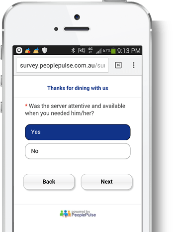
Limiting the size of your images also means they don’t crowd smaller mobile screens. Our advice is to simply include a small version of your company logo at the top of the first page, and decorate the rest of the survey with relevant colours in line with your business’s branding guidelines. Whilst your logo on every page of a desktop survey often makes sense you need to ask if including a logo on every page of a mobile survey is a necessity. Deliver a minimalist, fast, one question per page mobile-optimised survey and watch your response rates soar.
Happy surveying!
Ready to run to your next research project?
We’d love to speak with you to see if we can assist with your next mobile research project – please give us a call on +61 2 9232 0172 and ask for an obligation-free quote from one of our Business Solutions team members. Alternatively, drop us a note.
![]() Get a Demo:
Get a Demo:
We have helped over 1,000 organisations to utilise feedback as a means to improve employee engagement and increase customer satisfaction and referrals. And now we’d love to help you!
Phone us on +61 2 9232 0172 or submit your demo request today via the form below:

 Exceptional Survey. Solutions