The Importance of Dynamic Question Types
Thanks to their ubiquity and accessibility, mobile devices are increasingly being recognised as an ideal platform on which to reach consumers and conduct surveys.
The stats say it all: Australians are spending more time fixed to their mobile screens than ever before. Research from Deepend reveals that more than a third of Australians access the internet on their mobiles at least five times a day. Meanwhile, a quarter spend over 10 hours a week browsing the web on their mobile – and this is only accounting for their mobile use while at home.
This unparalleled potential for reach, however, can go to waste if your survey is using the wrong question types. Mobile screens are obviously much smaller than those on desktop computers, and hence it’s vital to consider the implications this can have on the type and layout of questions in your survey.
In this edition of Mobile Matters, we take a look at what dynamic questions are and how you can rectify this common issue for one of the most commonly used question formats – the Matrix question.
The Problem with Poor Question Layout
Grid – or matrix-type questions – are a proven and effective question type used by researchers the world over. Because they utilise a broad matrix of questions and a range of answers for your respondents to pick from, they can be a great way to explore a topic in depth and gain valuable data from customers. Matrix questions deliver the clear benefit of being able to neatly display a common answer scale for a set of related questions.
However, while matrix question types usually work seamlessly on large desktop displays, displaying them on a smartphone where respondent’s fingers can sometimes cover 2-3 answer options at once can cause chaos. Refer exhibit A to the below:
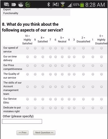
Kantar’s Mobile Trends That Matter Tomorrow report reveals that most smartphone buyers opt for a device with a screen size between 4.7 and 5 inches. Delivering a matrix question with more than five separate questions, and a 10-point rating scale, can thus be a challenge on such small displays.
Aesthetics aside, the user experience is severely damaged, with respondents having to swipe left and right to select their answer options. Mobile consumers value clean, easy-to-navigate interfaces, and are more than happy to drop out if a survey is even slightly difficult to complete.
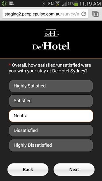
This eliminates the need to clumsily navigate the survey on small mobile screens, moving not only from top to bottom but also left to right. Respondents are delivered one question at a time – with all options neatly fitting a single page – so they can take care of them quickly and easily and progress through the survey with minimal fuss.
The awkwardness of grid questions and formatting them for different screens should not preclude you from including them in your survey. Thanks to dynamic question types that automatically detect the user’s device, you can be sure to deliver an optimal user experience for your survey respondents.
Happy surveying!
Ready to run to your next research project?
We’d love to speak with you to see if we can assist with your next mobile research project – please give us a call on +61 2 9232 0172 and ask for an obligation-free quote from one of our Business Solutions team members. Alternatively, drop us a note.
 Get a Demo:
We have helped over 1,000 organisations to utilise feedback as a means to improve employee engagement and increase customer satisfaction and referrals. And now we’d love to help you!
Phone us on +61 2 9232 0172 or submit your demo request today via the form below:
 Exceptional Survey. Solutions
Software Proudly Developed
Hosted & Supported:
From Australia